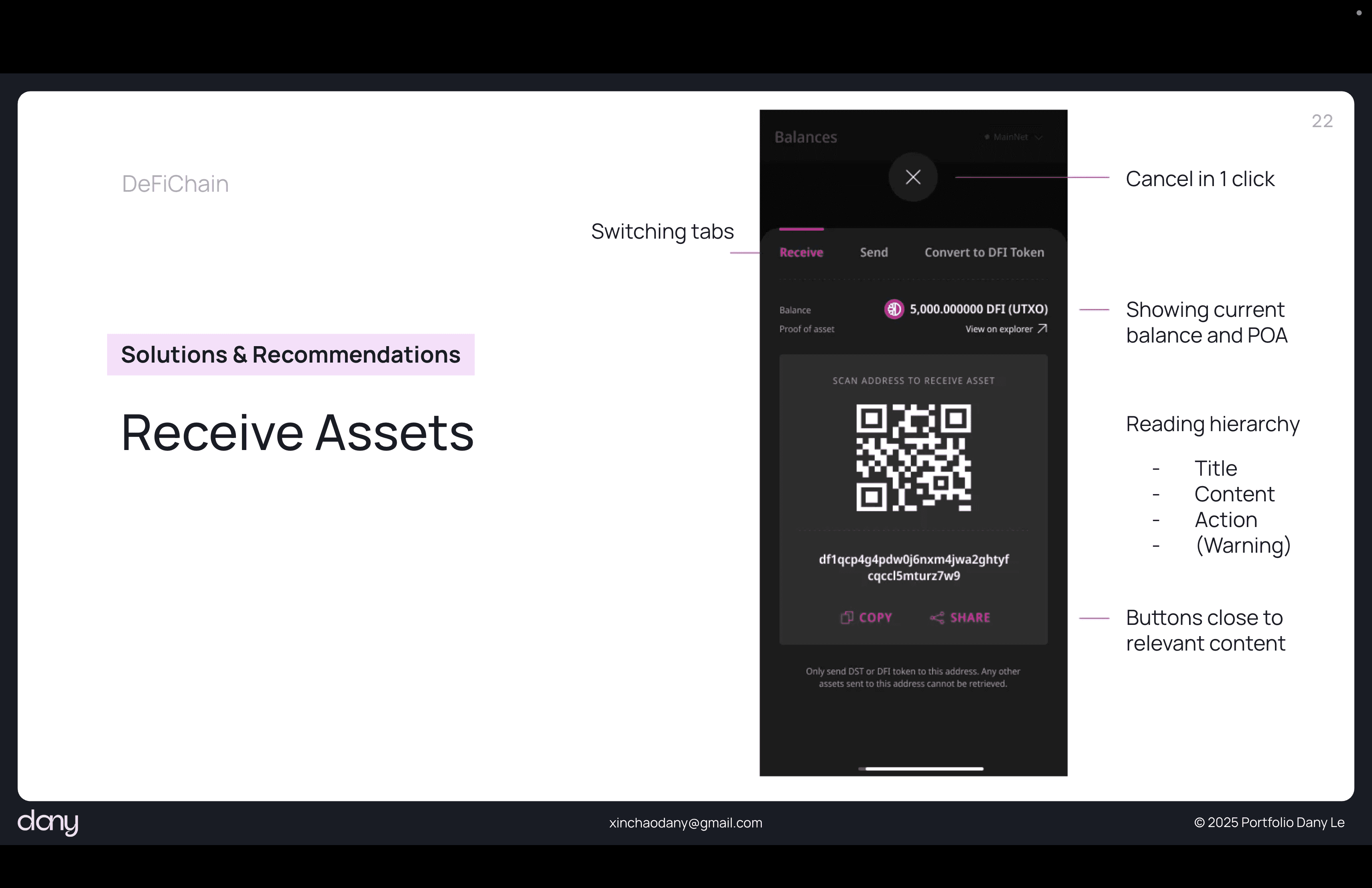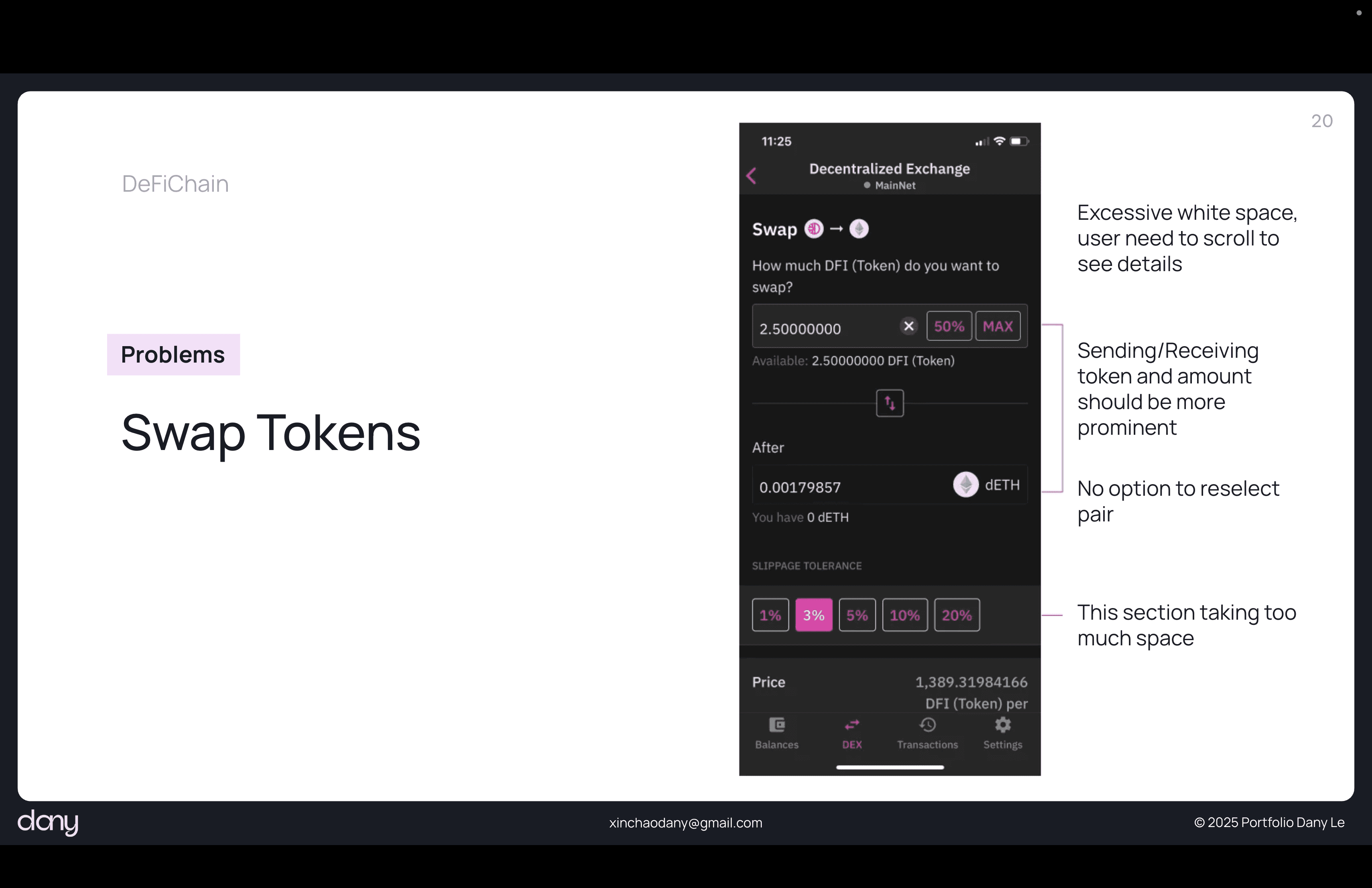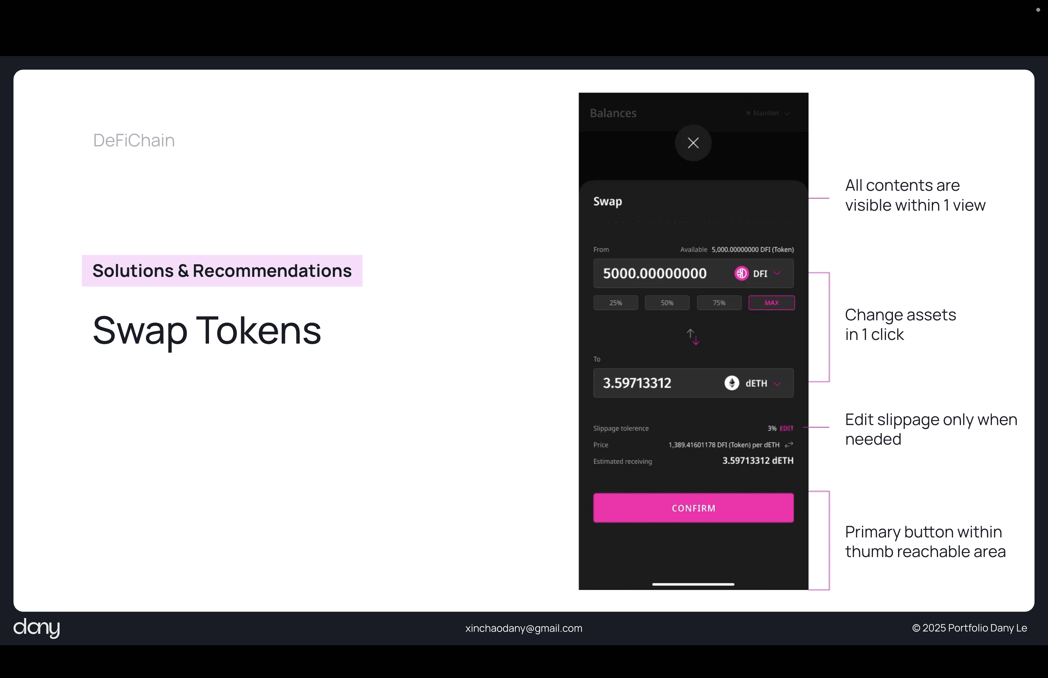
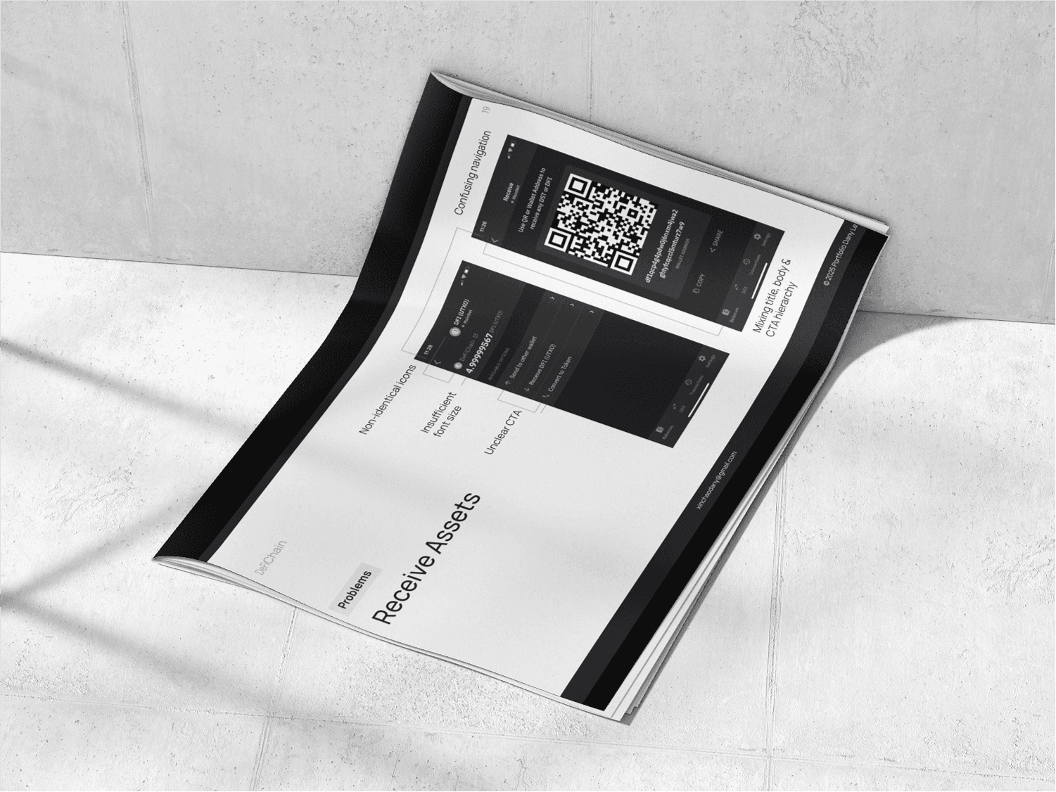
DeFiChain Wallet
The mission —to conduct a comprehensive UX/UI analysis of the DeFiChain mobile application to identify usability issues, design flaws, and opportunities for improvement to enhance the overall user experience for both new and experienced users.
ROLE
PROBLEM
The decentralized finance (DeFi) space is inherently complex, with concepts like staking, liquidity pools, and decentralized exchanges (DEX) often presenting a steep learning curve for users. The DeFiChain app, while functionally robust, faced the challenge of translating this complexity into a clear, intuitive, and secure mobile experience.
UX/UI Analysis of the DeFiChain Mobile App
As a UX/UI designer, my primary responsibilities included:
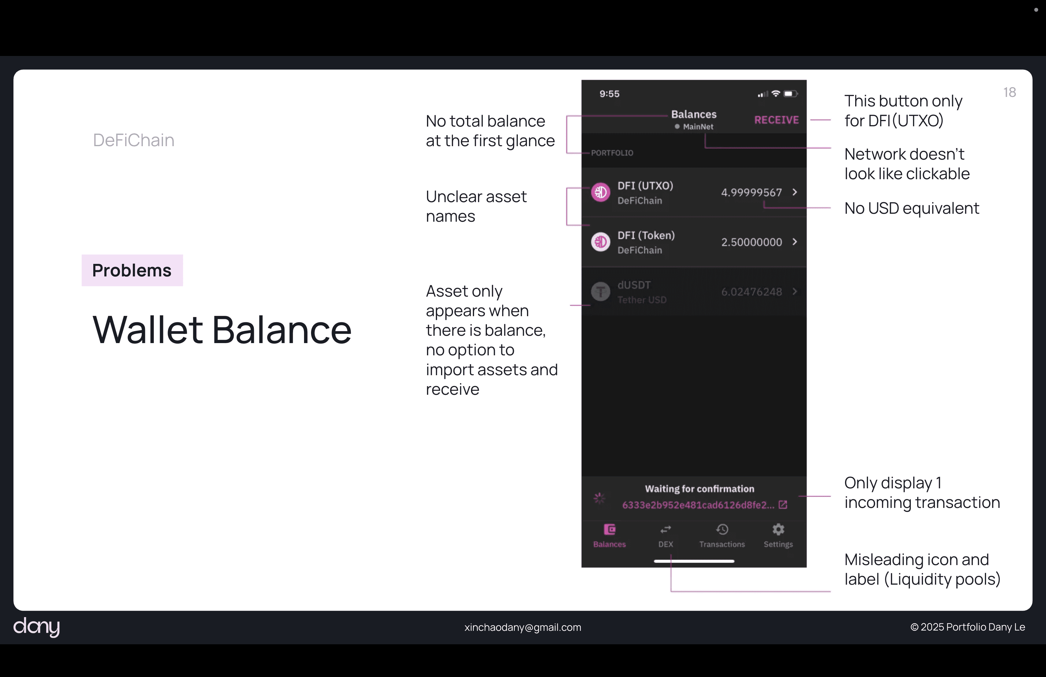
Heuristic Evaluation: Auditing the existing app against established UX principles (e.g., Nielsen's heuristics) to pinpoint design inconsistencies and usability bottlenecks.
User Flow Analysis: Mapping out critical user journeys, such as token swapping, staking, and asset management, to identify points of friction and inefficiency.
Comparative Analysis: Benchmarking the DeFiChain app against other leading crypto and DeFi platforms to understand industry best practices and identify competitive advantages.
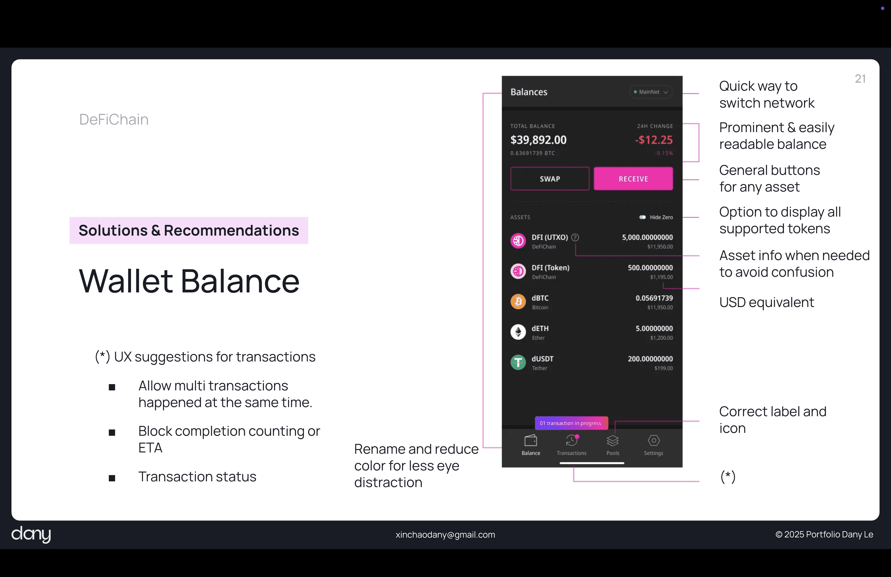
UI Assessment: Evaluating the app's visual design, including its information architecture, visual hierarchy, and overall aesthetic appeal, to ensure a modern and trustworthy interface.
In Conclusion
This analysis serves as a foundational document for future design and development sprints, ensuring that the DeFiChain mobile app evolves with a strong, user-centered approach, ultimately leading to greater user adoption and satisfaction.